
Converted dormant accounts from as far back as 2016 into first-time subscribers.
The previous button for “Upgrade to Premium” was not a convincing argument for users to upgrade their accounts - nor do they understand the value they would receive when subscribing.
With the new messaging and UI for the subscription tier, there was a huge surge of subscriptions shortly after the feature was launched.
Product Owner & Designer
B2C | Q4 2024
Re-Design:
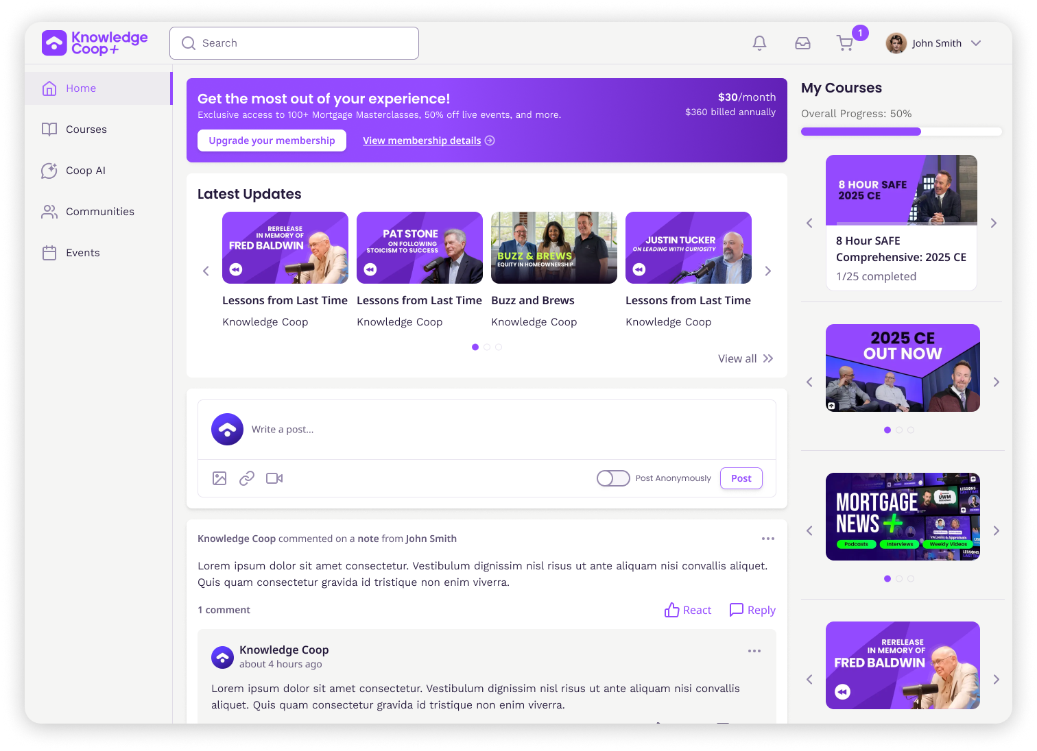
Positioned the new UI messaging to most frequently visited areas
Based on the heat maps and many recordings of user interactions, I intentionally positioned the new messaging on the top of the pages. The aim is to increase visibility of the subscription tier without being looked over.

Previously:
Significantly improved the visual accessibility of the CTA button
After testing the CTA button, it failed all criteria for color contrast guidelines in accordance to WCAG. With the additional consideration that Coop+ users are an older demographic, it is especially important to target visual issues that would impede on the user experience.
47% MoM increase in new subscriptions, a 33% YoY growth, a 750% YoY surge in renewal revenue!
After this surge, I interviewed several Coop+ users to better understand their perspective on the new feature and how it informed their decision to subscribe to the platform. Some conversations went as follows:
Me: “What were some perks you didn’t know about before the feature?”
User: “I didn’t know I could save 50% on live CE and I’ve been attending for years at this point…”
Me: “What made you decide to subscribe or consider subscribing?”
User: “I just never thought about it before and I’ve been taking training from you guys for the last few years. When I saw what the subscription included, it was just a no brainer.”