

tix4cause
⋆
tix4cause ⋆
Background
UX/UI Designer and Marketing Strategist | 8 month contract
Deliverables: Mobile low/high fidelity wireframes, web low/high fidelity wireframes, user admin web view, marketing WordPress website, design system, and 2D/3D prototypes.
The main tools I used during this contract: Figma, Jira, Confluence, Slack, Zoom, Adobe Illustrator, Statista, and Google Drive.
Team: Project Manager, WordPress Web Developer, Software Developers, Backend Developers, CEO, & CTO
After many zoom calls with tix4cause’s team (CEO, stakeholders, and their backend API engineer), we discussed through several marketing strategies to implement in their WordPress website and concluded on the following solutions:
Including more content to the front-facing website to renavigate desktop users to the main web app
Implement company mission via live counters that record number of donations made by ticket purchasers
Simplifying the user flow of purchasing non-donated tickets and claiming donated tickets
Developing marketing strategy to improve conversion rates
Design Timeline and Accomplishments
Initially, I was hired to create the concept design of their mobile app. After our collaboration on the app, the team wanted to move forward to bring the concept to development. The success of the mobile app inspired the tix4cause team to hire me again to design their desktop experience.
During the design process, my designs were used as reference for Chop Dawg’s design interns and have shifted the overall agency’s design process as a whole. Because of the efficiency of my work and the quality of my deliverables, Chop Dawg’s PM encouraged the designers to refer to my designs when conducting their own contributions.

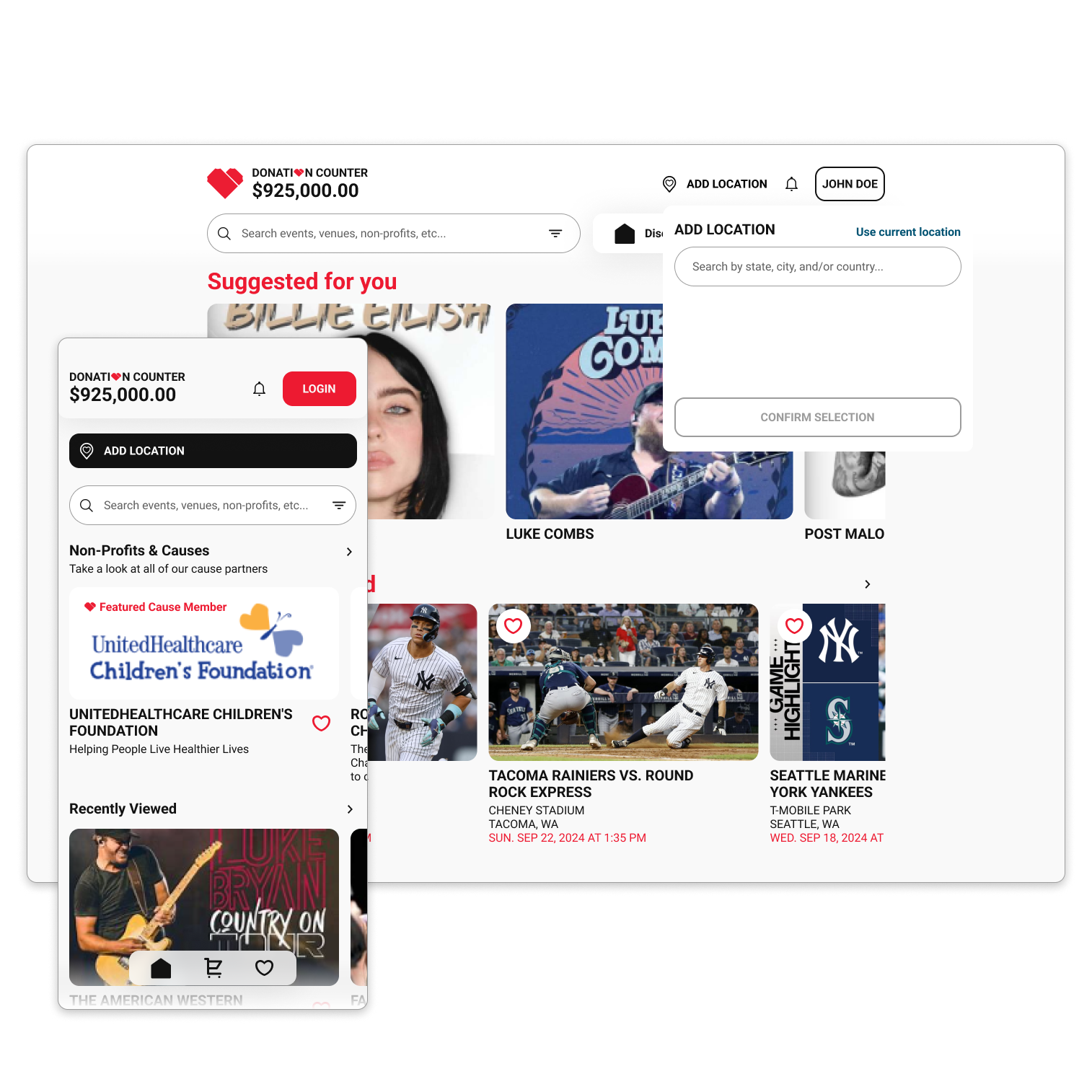
Discover & Donate
Users find events near them, pick the perfect seats, and choose a registered nonprofit for part of the ticket revenue—all from a single screen. Every transaction is a tangible act of generosity.
Multi-Platform Accessibility
Built for iOS, Android, and web, Tix4Cause aligns with any device preference. Through a consistent UI and real-time synchronization, users can browse, buy, or donate from anywhere, at any time.

Transparent Transactions & Receipts
Integrated secure payment methods—like Apple Pay, Google Pay, and credit cards—and built out automated email receipts. Clear cost breakdowns keep donors informed, building trust in every purchase.

Personalized Event Alerts
Users set up alerts for specific ticket prices, seat types, or donation preferences. Tix4Cause automatically notifies them if a matching listing appears, keeping audiences engaged and increasing cause support.

Nonprofit Discovery & Engagement
A dedicated hub showcases popular and local charities. Contributors can learn about each cause’s goals, social links, and impact stories—ensuring every donation resonates deeply with personal values.
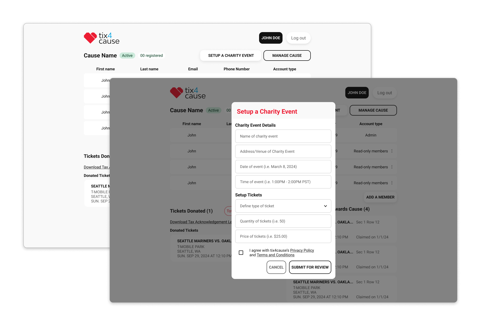
Donor & Vendor Collaboration
Whether a venue offloads unsold seats or a fan donates playoff tickets, Tix4Cause merges these streams, highlighting philanthropic angles. The system seamlessly handles partial or full proceeds for multiple charities.
Low & High Fidelity Wireframes

In the original design for the website, users are presented a long list of causes prior to checkout. I designed a feature and proposed it to the CEO where it would decrease time of checkout if user’s are presented a featured cause. This feature aims to diminish decision paralysis and helps users guide their choices.


In the low fidelity wireframes, I strategized with the CEOs and stakeholders on how to format the discovery page. Considerations that were made: Priority of having the user’s unique experience prioritized at the top, dynamic live donation counter to visualize live impact, and modular layout.
If I could go back in⏱️time, what would I do differently?
To be quite frank, this project was the smoothest collaboration I’ve had thus far so there isn’t a lot I would do differently. I applied many of the lessons I learned from previous client experiences and the team at tix4cause were attentive and responsive. The clients provided valuable feedback and I was able to effectively design their product exactly how they intended. While we had some challenges along the way regarding the strategies we wanted to implement, the communication and iterative process of our collaboration allowed us to funnel ideas and refine them.
The only aspect I would’ve done differently for this product would’ve been to expand on the marketing assets for their online presence. After curating more marketing materials between the time I finished the mobile app design and being re-hired for their web experience, I had more experience and ideas for those assets.