ParkKing
Designing Opportunity for Renting Out Unoccupied Parking Spaces
- Role
- UX/UI Designer and Brand Designer
- Company
- ParkKing Startup
- Timeline
- 6 month contract
- Team
- 2 Project Managers, WordPress Web Developer, Software Developers, Backend Developers, CEO, & CTO
- Tools
- Figma, Adobe Illustrator, Jira, Confluence, Slack, Zoom, Statista, and Google Drive
- Deliverables
- Mobile low/high fidelity wireframes, web low/high fidelity wireframes, user admin web view, marketing WordPress website, design system, and 2D/3D prototypes.
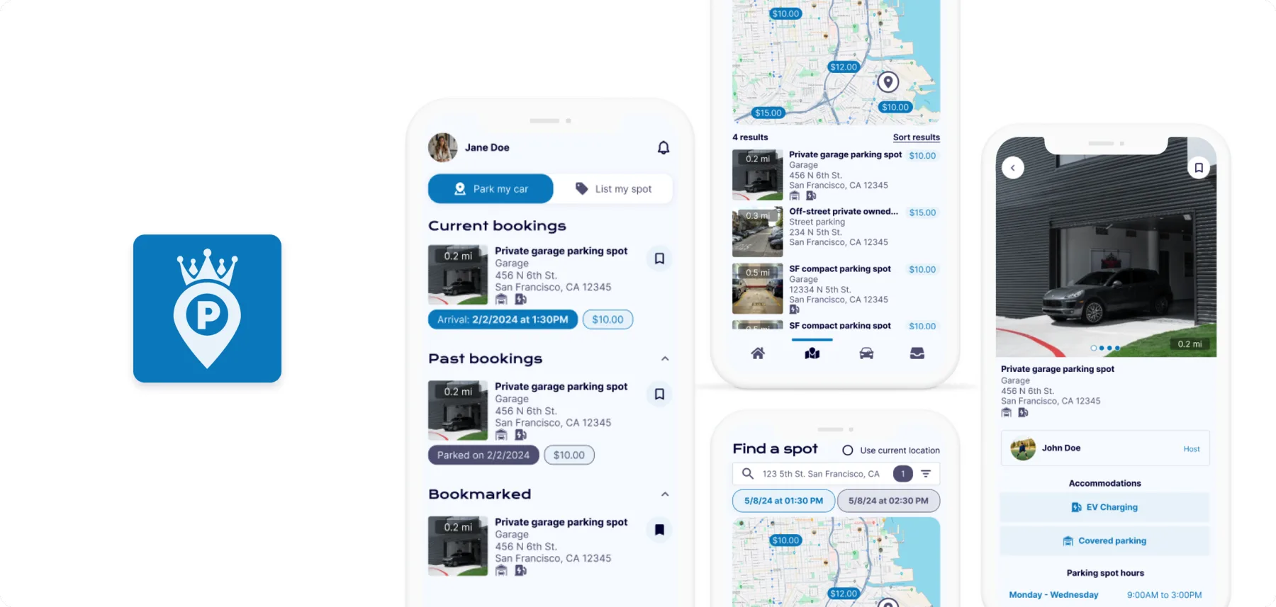
Here to save the day — especially after the client had such a bad experience with a previous contractor
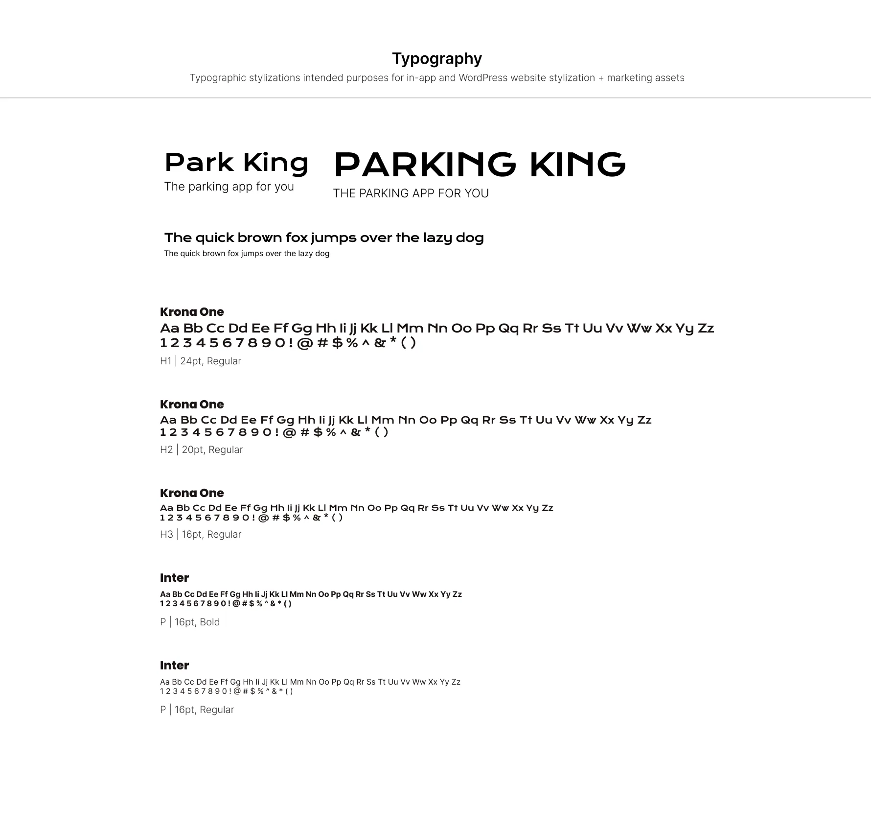
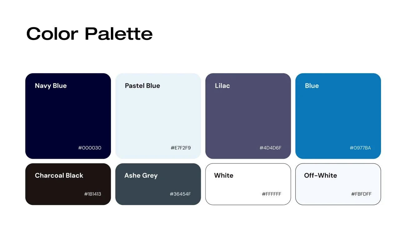
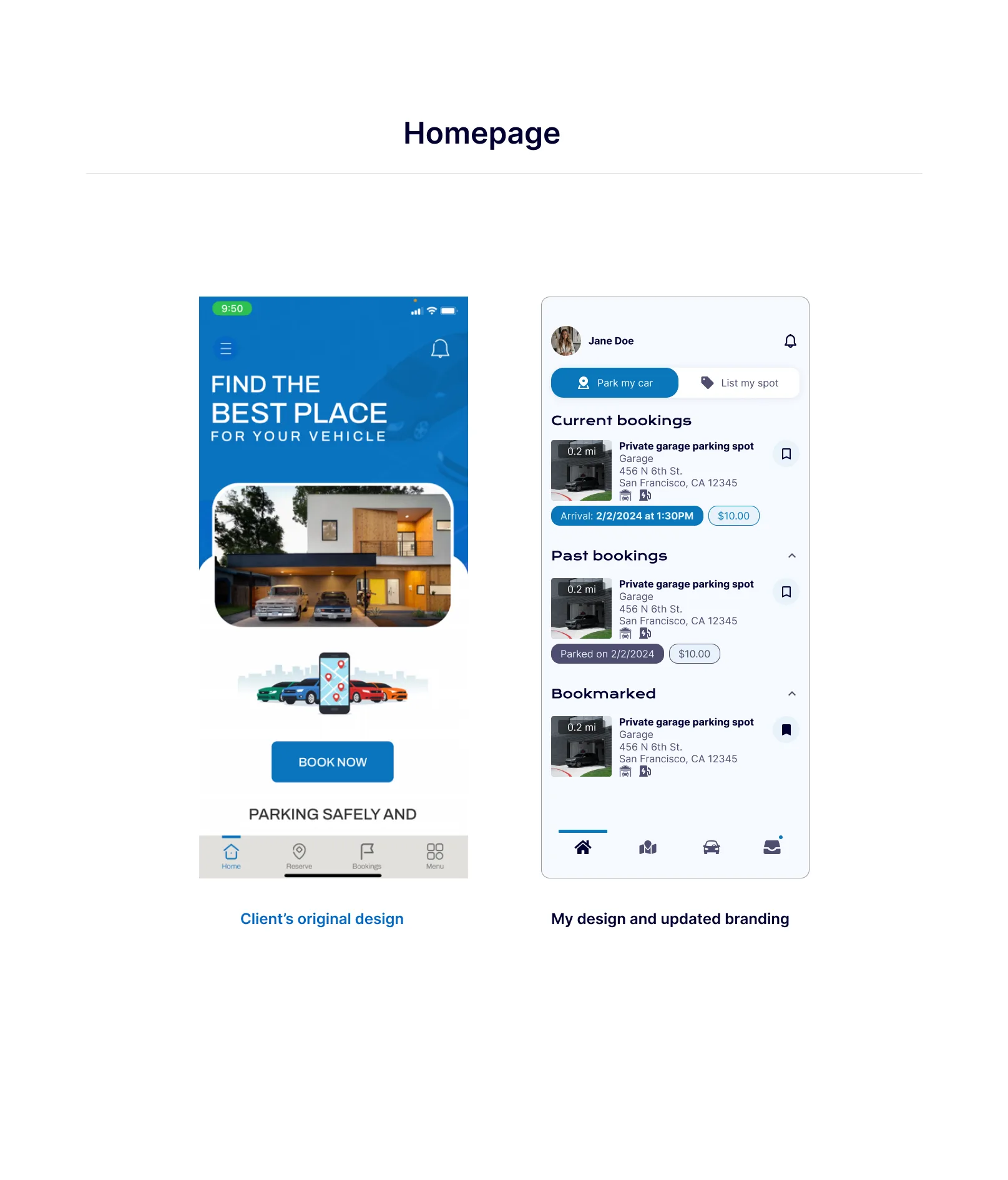
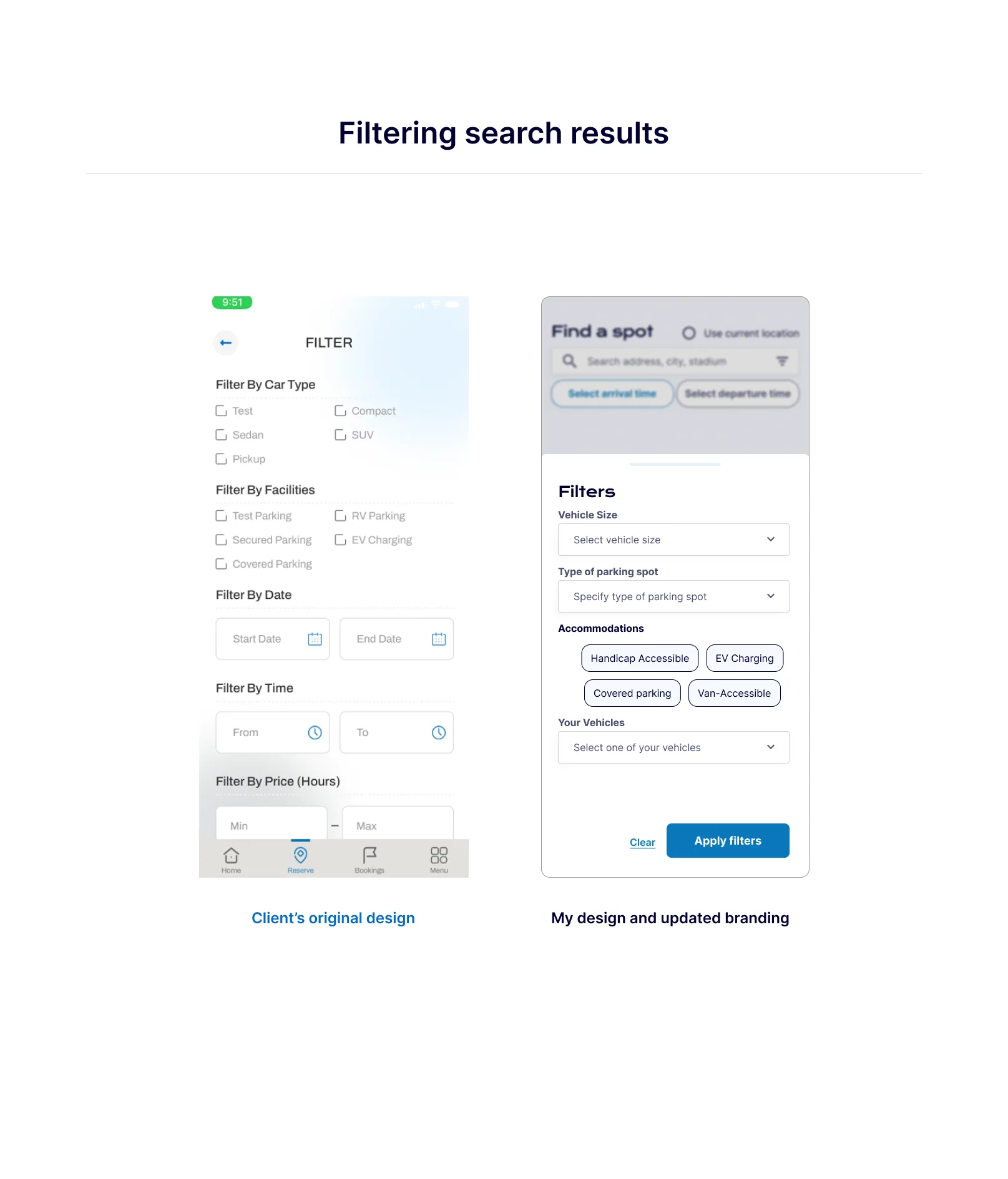
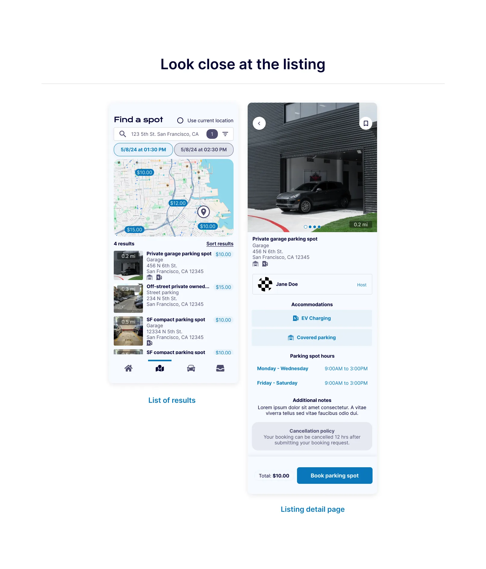
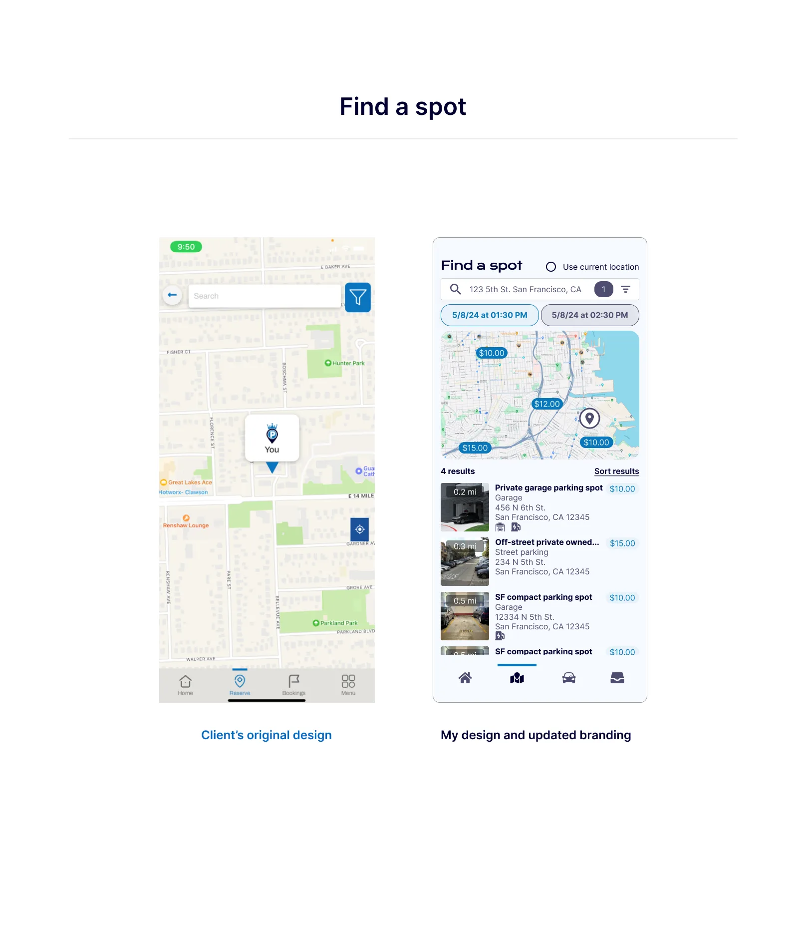
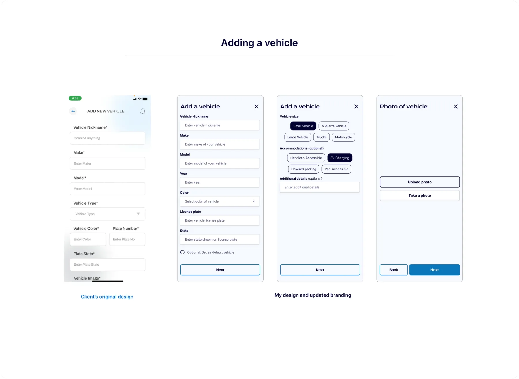
The Founders of ParkKing had initially hired an agency that scammed them of their product. Coming to Chop Dawg, they were looking for a new start. After learning about their experience, I made the effort to ensure they felt confident in the progress we made during the design phase through detailed documentation and outlined meetings. I also provided the partners industry suggestions in navigating their brand and improved their brand identity altogether. When the clients approached for my expertise, they had no design system or formal brand guidelines for their application. After several consultations with them using design explorations and style guides, we finalized on the following updates:
- Sans serif fonts with more personality for the headers
- Blue color theme to evoke a sense of trust and reliability
- Modern design and feel
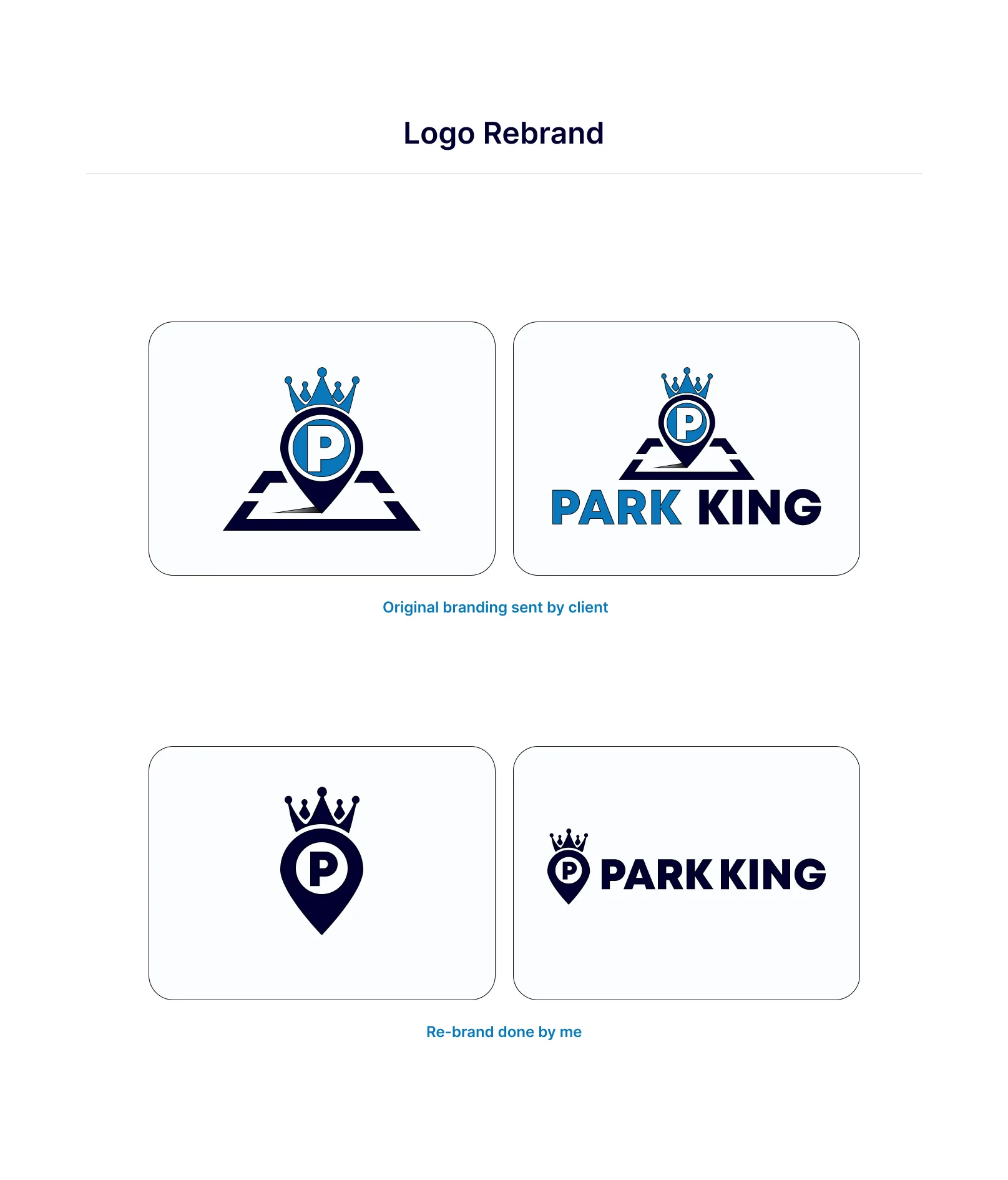
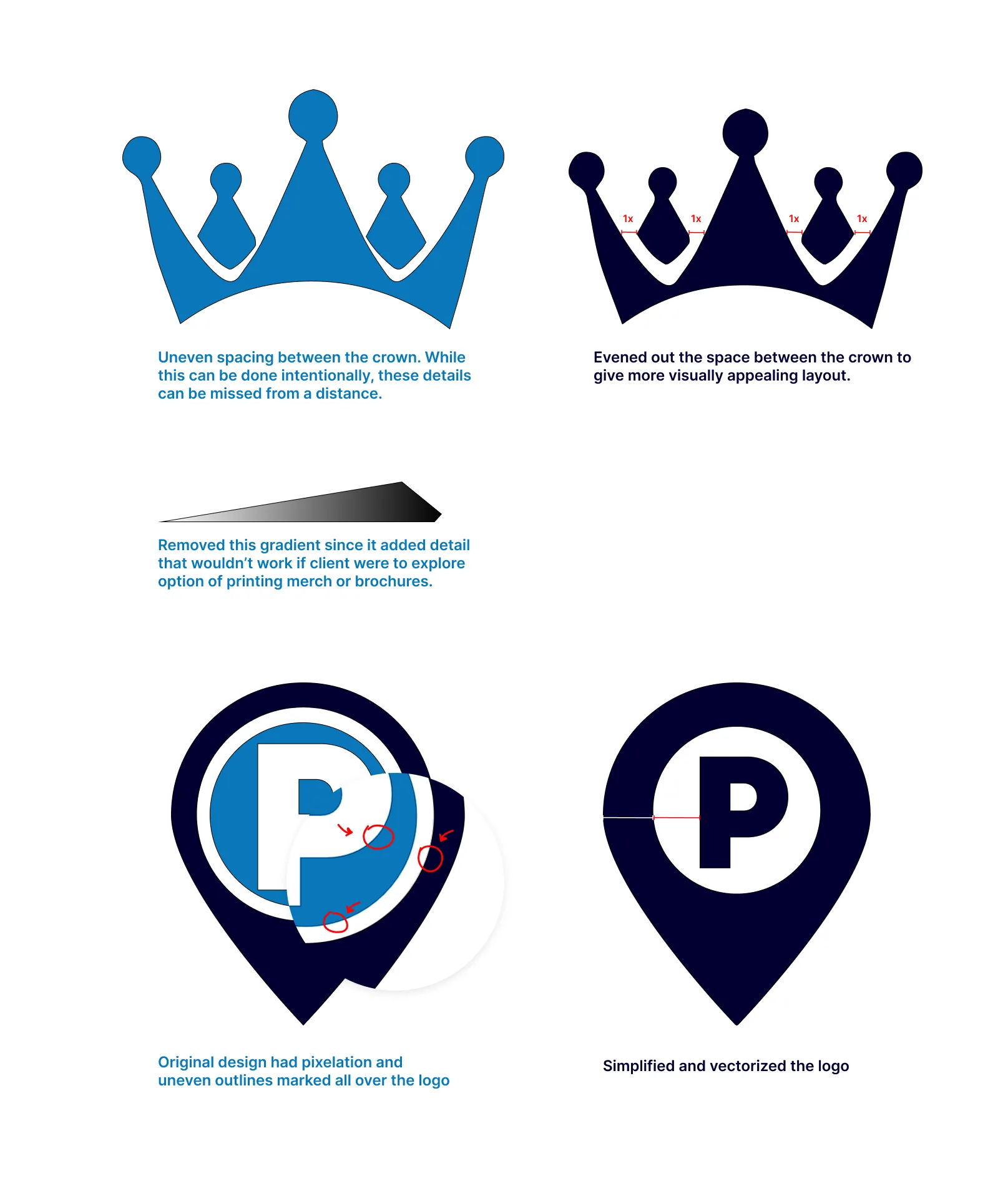
The original logo was not responsive, had inconsistent spacing, and gradients that didn’t consider other potential backgrounds other than white.
With the updated version of the logo, I simplified it while keeping the key elements such as the crown. I made necessary adjustments to the spacing within the crown and added sufficient space inside the logo. I kerned the wordmark as well.
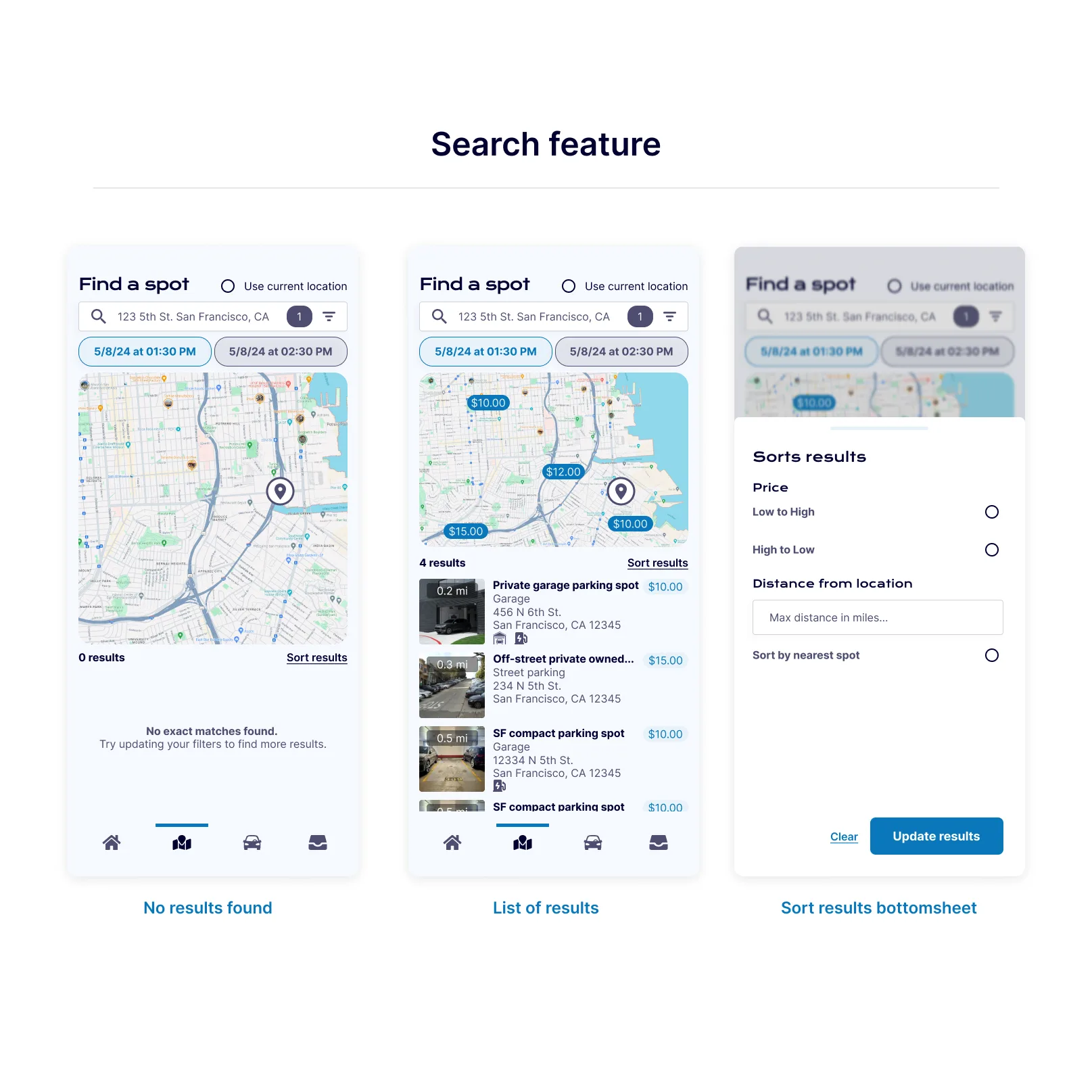
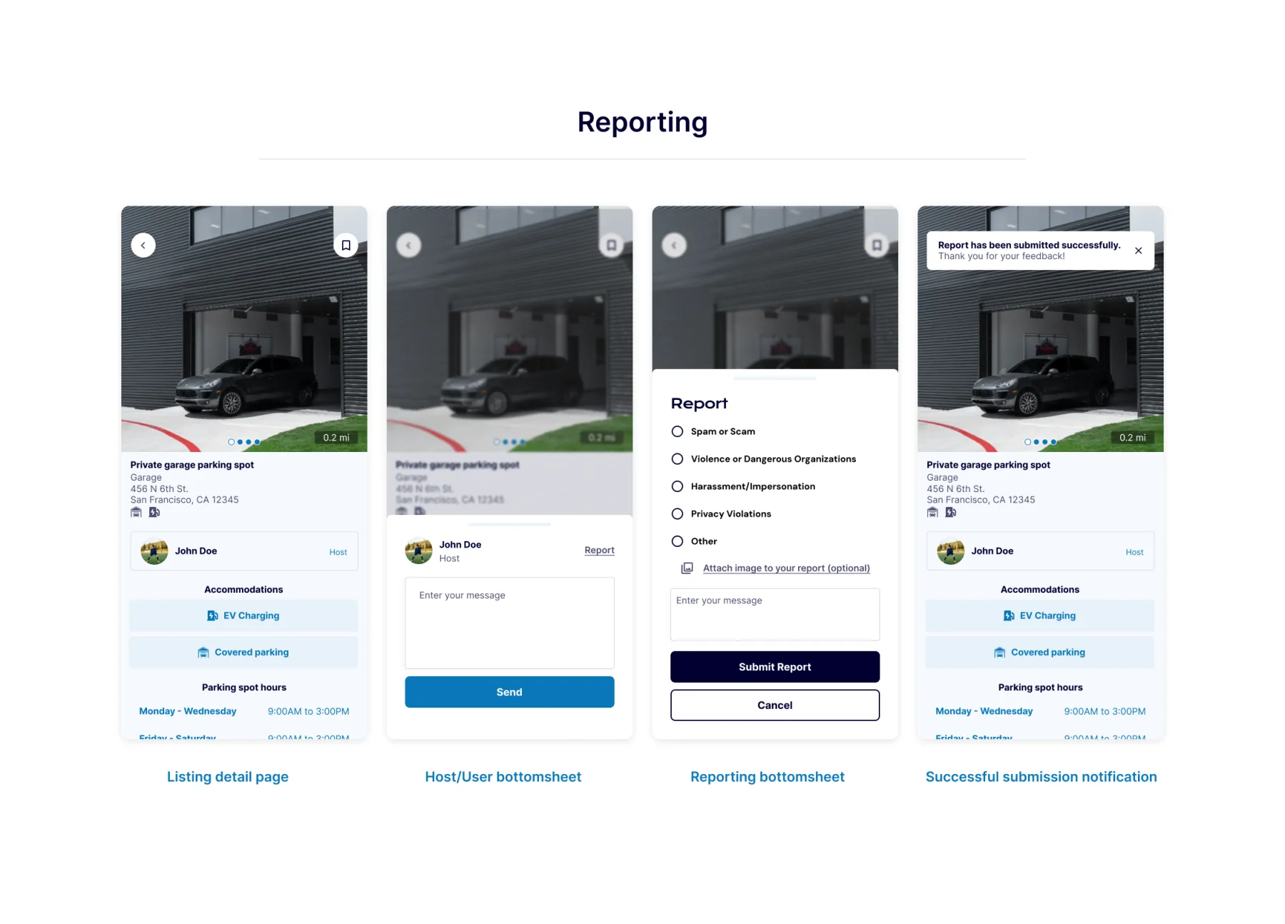
High Fidelity Wireframes
If I could go back in time, what would I do differently?
Knowing what I know now, I would’ve gone the extra mile to create a more detailed information architecture map with specific examples from existing applications — outside what was made in reference to the statement of work that was provided. I learned that for many partners I work with, they share the common pain-point of interpreting UX flows and understanding why certain methodologies are industry-standard. With providing real examples and explanations paired with a map that’s in parallel to their application, this can help bridge the knowledge gap.